
 |
| TRU DAT |
I’M PIMP TIGHT
This quote comes from a peer about “FREE” work:
If you are good at something you never do it for free. This guy should get bent.
That same quote NOW through the PIMP TRANSLATOR:
Yo If you be pimp-tight at somethin` you never do it fo' free. dis here nigga should git bent Ya' dig?
 |
| YA DIG? (Pimp Rabbit Muse found on GOOGLE) |
I dig. But I sometimes question my own ability at pimp tightness - I think we all do at one time or another…
 |
| "WE PIMP TIGHT!" I seriously GOOGLE IMAGE'd "pimp tight" and this came up... |
Translation brought to you today by: http://joel.net/EBONICS/Translator
And the letter:
 |
| Whateverthehellthisis |
WORD ASSOCIATION
 |
| MAGIC! |
 |
| One of my latest... Doug Henning is LIVID! |
 |
| BANKSY's Detroit Rat is wearing MAGIC PIMP'S star glasses! |
CRAIG
Our dear friend Craig had this on his list:
PEOPLE RECRUITING FREELANCERS
Our dear friend Craig had this on his list:
PEOPLE RECRUITING FREELANCERS
Date: 2011-06-27, 12:51PM CDT
Reply to: job-z7tet-2465211908@craigslist.org
To those employers creating posts for take-home or freelance, pay-per-project jobs: please stop insulting those of us with talent and pay us what our artwork is worth. We are trying to make a living just like you, but you all think you can get by with giving us the less-than-bare-minimum needed for us to earn any kind of livelihood. If you want to pay $25 for a job, ask your nephew to create you something in Microsoft Paint. If you want talented artwork that sells your products and your business, you have to spend real money. I like to think of myself as one of the most affordable designers out there, but man, it's not even worth my time to send my samples to some of you recruiters. <http://oklahomacity.craigslist.org/med/2465211908.html>.

THE USEFUL PART OF THE BLOG - SORTA...
HEY WHIPPLE-SQUEEZE THIS!

That's "Amazon Book Store," not AN AMAZON. This book is quite possibly the BEST book I have read on the topic of creativity and ad design. It is humorous, inspirational and intelligent. Sullivan is old hat (and a succsessful one at that) to the ad industry. In fact, there are times when his confidence seems to be the source of his advice. It is one of those books I constantly pick up and put down so much that I don’t know where it is… I also read it.
CAUTIONARY NOTE: If you are NOT a graphic designer or an ad creative, the rest of this section is going to numb your brain. You may just want to skip ahead to the cute bunny pic.
If you don’t like rabbits, skip right to the PIMP NAME GENERATOR. You can thank me later...
I have posted an excerpt from his book (taken from another blog site < http://adland.tv>). It is on my favorite topic, THE HACK. As I mentioned before, I am not always confident about my PIMP TIGHTNESS. Often times I do feel like a hack. Therefor, I tend to enjoy reading about them. Remember, rule #1 for graphic designers is: THERE WILL ALWAYS BE SOMEONE BETTER THAN YOU. Sometimes it feels as though EVERYONE is better…
HACK - BY LUKE SULLIVAN
CAUTIONARY NOTE: If you are NOT a graphic designer or an ad creative, the rest of this section is going to numb your brain. You may just want to skip ahead to the cute bunny pic.
If you don’t like rabbits, skip right to the PIMP NAME GENERATOR. You can thank me later...
I have posted an excerpt from his book (taken from another blog site < http://adland.tv>). It is on my favorite topic, THE HACK. As I mentioned before, I am not always confident about my PIMP TIGHTNESS. Often times I do feel like a hack. Therefor, I tend to enjoy reading about them. Remember, rule #1 for graphic designers is: THERE WILL ALWAYS BE SOMEONE BETTER THAN YOU. Sometimes it feels as though EVERYONE is better…
HACK - BY LUKE SULLIVAN
LUKE SULLIVAN’S BLOG (What can I say – I’m a fan!)
YOU CAN BE HIS FRIEND ON FACEBOOK! (I’m his Fbook friend!)
YOU CAN BE HIS FRIEND ON FACEBOOK! (I’m his Fbook friend!)
YOU CAN BE MY FAN ON FACEBOOK! (Do it! You KNOW you want to… All the cool kids are doing it…)
 |
| No... THE BOOKSTORE! |

“Love the animals: God has given them the rudiments of thought and joy untroubled.”
-- Fyodor Dostoyevsky
PIMP NAME
Reverend Doctor Collins Rockefeller
http://www.playerappreciate.com/pimphandle.asp
The MOST ironic thing about these result is that when I became a mail-order reverend, I also purchased the title of “Doctor of Mythological Studies.” I did this SPECIFICALLY so that I could have the title: "REVEREND DOCTOR."
Reverend Doctor Collins Rockefeller
http://www.playerappreciate.com/pimphandle.asp
The MOST ironic thing about these result is that when I became a mail-order reverend, I also purchased the title of “Doctor of Mythological Studies.” I did this SPECIFICALLY so that I could have the title: "REVEREND DOCTOR."

 |
| My Inspiration: The Reverend Jim Ignatowski |
Be like Me and Reverend Jim! ORDER YOURS TODAY! : http://www.themonastery.org/
Click the button on the top right to GET ORDAINED.
Click the button on the top right to GET ORDAINED.
MY REAL PIMP NAME
I will always be 1¢
 |
| Who is 1¢? (Portrait by Gary Wittenmyer) |
IDENTITY CRISIS
I did write a rap song under the nomenclature of NILLA WAIF… it goes something like this:
I did write a rap song under the nomenclature of NILLA WAIF… it goes something like this:
[Holla]
I’m Nilla Waif
Ay yo trip…
[Rap]
Skin aint white im veiny blue
Dats my Irish American ginger hue
mom's car is a Fords is my free free ride
only cuz – well… she up and died
She left hard for me in her will
Hold up homie, time for my pill… [PAUSE]
my 419 is worth 200 even
cant pay it so I try to believe in
Pimpin my art
Pimpin my heart
Pimpin in the Pimped Out
Pimpin Marts
I aint no 563
Fukk dat, G
I aint yo bitch
I be 5-6-6
I don’t answer yo knock. SO?
You got a problem wit dat? YO!
It ain’t about you yo psycho sycho-phant
It all about me not wearing any pants.
So just keep rollin past the door
I’m THE MAN’S underpaid in-house art whore
[Spoken]
Im the OGD – the Original Graphic DesignahI keep it real.werd.
[Drop mic]

 |
| I got cred. |
PIMPIN VECTOR PACK TO GO WITH MY PIMPIN RAP
Free vector “Pimpin Elements” for your pimpin pleasure: http://www.dragonartz.net/2008/05/29/pimpin-vector-pack/
Free vector “Pimpin Elements” for your pimpin pleasure: http://www.dragonartz.net/2008/05/29/pimpin-vector-pack/
 |
| Space Invaders? |
PIMP YO ART
Serious good advice about art licensing and how to contract in order to maintain creative rights. Trust me, this issue WILL raise its ugly head.
http://mariabrophy.com/business-of-art/licensing-your-art-to-a-skateboard-company-or-any-company.html
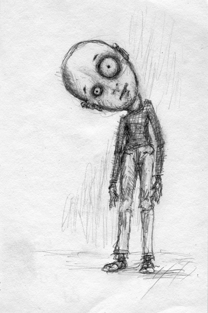 |
| About to raise his ugly head... (From my sketchbook) |
STUDIO 566 BUZ
 |
| Ground control to Major Bun... |
GO SEE THE MAN KILLING CLAM!


