Friday, February 25, 2011

ADVERTISING DESIGN - POST II

Another assignment. Gatorade. The first demographic is folks over 60. I shot for the Boomers.
The second demographic is kids 9 to 12. This demographic I went for Pokemon. Truthfully, I just wanted to draw Pikachu hammering back a Gatorade.


RESPONSE:
Penny you have done an excellent job using slogans and visuals that will entice your markets. The minimal imagery and color and the use of the product makes your first ad a huge success. The older generations have become accustomed to being enticed by modern and simplistic advertising pieces. I think that this is a very strong approach that they will gravitate toward. They will be able to focus on the words "Peace" and "Love" and then onto the headline. Good way to direct the gaze of your consumer.

Your ad for the younger generation is also very good. This can go a long way reaching your target audience by introducing some more vivid and intriguing imagery.


Yay Me! 

Monday, February 21, 2011

WEEKLY MEANDERINGS

CHILDHOOD
I had a rather eventful week this week. Well, it was eventful in my mind, anyway. I decided to try my hand at telling tales; not TRUE tales, mind you, but tales based on some truth. Here is CHAPTER ONE:

READ ME!

SEIFERT'S FARM MARKET was at the corner of HOWE ROAD and MOGADORE ROAD in my childhood. In the summer, everyone and their mother picked cabbage there... and it stank. Between the cabbage and humidity, there was a wafting of sheep manure. Sheep smells very differently than horse or cow. I still dream about the places of my childhood... manure memories.


NO CLASS
I finished my one class this week. I really was not a fan of the final project (A game geared towards tween girls). I drew a lot of girly things and felt girly shame. It isn't my "normal" fare. Here are my contributions (I was "illustrator," can you tell?)


I'm not completely thrilled with any of it. BUT, alas. I drew the girls for the front of the box, designed the box, did the box layout, designed the money, drew the dice, let's just say I illustrated all of the above. I thoroughly enjoyed doing it too. That helps; love what you do.


CHEDDAR BUNNIES
Honorable  #1 daughter gifted me with these from ANNIE'S NATURALS:

Honorable son nommed every one save for 5. I ate FIVE out of this entire box of bunnies. They are far better than cheddar fish crackers. I don't like cheddar crackers even -- honorable #1 daughter assured me "they" were out of the Bunny Grahams.
"They" being WALMARTS (That's how you say it in the Midwest). You can also purchase here:  http://annies.com


ODDITITTIES
Yes, typo but it stays. Do you love Shakespear? Do you love The Big Lebowski? Then you will love:


Yes, you read correctly,
TWO GENTLEMEN OF LEBOWSKI. It's a "tragical romance." The first 3 scenes are FREE! FREE! FREE! And of course I haven't read them. But you can! (The publication is NOT related to anything Coen Brothers, Universal Pictures, Big Lebowski enterprises or my next door neighbor). 

http://www.runleiarun.com/lebowski  


ESCAPE FROM HAMSTERDAM
The KIA website has this game where you launch your hamster and he bounces down the road. I can't bounce my rodent very far. In fact, I slammed into the side of my tank once. This reminded me that we had 2 gerbils. One became pregnant and had a litter. We separated her from him and they each had their own tank, just like in this game. She jumped out of the tank, just like in this game, right into his tank. We had another litter. He jumped out once and everything that was as tall as him ended up chewed on. One day, I heard a scratching in the kitchen. He was in the bottom drawer of the stove, where I keep pots and pans. I imagine he was considered a GOD when I put him back in his tank, put a screen with a book on top of it. He has seen "OUT THERE." Anyway, I can't bounce my rodent very far in this game...


TEACHER'S PET
I was asked by an art teacher to use one of my bunnies for an exercise. The exercise is ATTACK or DEFEND. The subject is this guy --------------->

If I get any results from that assignment, I will post. Otherwise, what would you do? What would Jesus do? If the bun's eyes glow, I would probably pee my pants.

KIDS
Saw this and though it was the cutest thing... White Bread Baby!

Saw this and was... uh.... um.... "NO." White Trash Baby!
She is overjoyed to have a future on a pole. That looks like a double wide. I can say these things, I'm white trash. I do not know why this picture bothers me. I loved the Cracker Jack tatts. I have tatts. It's the TRAMP STAMP aspect of it, I think.


See her at WALMARTS.


OBEY
One of my favorite artists is Shepard Fairey. He is best known for his Obama HOPE poster. The AP also sued him for his Obama HOPE poster. Actually, AP threatened to sue so he sued FIRST then they countered. This is from the man who sues Baxter Orr for parodying HIS (Fairy's) work and calls him a "parasite" for doing it. The from-a-well-to-do-family-and-RISD-grad has come a long way -- full circle. Shepard Fairy, you had me at "OBEY."


Saturday, February 19, 2011

ADVERTISING DESIGN - POST I

My new class is Advertising Design. My first critique assignment is regarding a BAD PRINT AD. I knew exactly what I wanted for this assignment. I will warn you, I am rather terse having not had my coffee when writing this.
+++++++

Our local rags have some of the most HIDEOUS examples of ads. I also have had MUCH experience in rendering BAD DESIGN (to the point I need re-education--ergo back in class). I did not have one of our fine Pulitzer Prize winning papers so I ended up trolling the net. I found one. It could have been pulled right from the local paper. Oh my goodness, where do I begin?

http://a6.sphotos.ak.fbcdn.net/hphotos-ak-snc6/185747_1645108325390_1167353183_31433467_5725728_n.jpg
and now... THE CRITIQUE

I see a grid, of sorts, used for this design. The middle and right column need adjusting but as you can see, with the entire text of WAR AND PEACE being inclusive in this ad, I suppose some pragmatic license had to be taken. I do not see the implementation of the Golden Mean, it is more like the Golden Meandering. I would kill the center justified text, move the center column to the left and try to pretend I am doing this ad in good conscience. I can ALMOST live with the center justified text of the headline, but the mix of ragged right and center justified throughout the piece is daunting and really cuts into the quality of the layout (well, what there is of the layout).

I also see a prime example of a waste of full color. If a business is going to pay that kind of money, I would think the investment would be in high resolution graphics and intelligent color use. The visual is a reflection of the business; why would a business settle for low resolution images, poor typography, typographical hierarchy and design? Of course, I have equal passion for B&W ads. Is this photo part of the product or an afterthought? And what is that thing on the viewers left? I suspect that someone read in DESIGN 101 that RED draws attention and so the visual hierarchy for this ad is born. 

I NEED THIS!!!!

I love the comic book explosion to draw me to the yellow BONUS! in italics. I am pleased to see HELVETICA as opposed to ARIAL. 

by ~swisspoly92

This MARK SIMONSON article is a MUST READ for all designers:

There is also just way too much text. More is not better in this case. More is usually not better in terms of print ads, period. The message, quite literally, gets lost in text. Add bad design on top of all of this and the communication is done. People will skim over and turn the page. Who is the target audience? The guy living in his mom’s basement who has a closer relationship with the internet than any real life human being? I have no idea. What is the message of the ad? I don’t know, I’ve already turned to the funny pages to read about Diblert’s shenanigans:


PS: I was going to critique the following ad which actually MADE IT TO PRINT. I fear that I buckled to the will of GOOD TASTE as it is too early (in class) for me to let it all hang out. BUT - seriously - WHO OK'D THIS?????

http://a4.sphotos.ak.fbcdn.net/hphotos-ak-snc6/181795_1645108205387_1167353183_31433466_113596_n.jpg
+++++++
And now, time to draw some bunnies.


Saturday, February 12, 2011

NO SHIP LIKE FRIENDSHIP

FRIENDS OF BUNNIES
The Bunny Stop® is introducing “FRIENDS OF BUNNIES.” [insert the roar of the crowd here]. So far, Bunny has 2 friends (which is more than I seemingly have). More friends will continue to find a home at The Bunny Stop®.


This is Sir Ham the Hamster. He is most definitely hanging in there! I almost can't stand how cute he is on my fridge! I love exclamation points!


Stay tuned for the FRIENDS OF BUNNY line to be formally introduced! Same Bat place, Same Bat blog!

VanGogh is LIVID!

A LITTLE HERO WORSHIP
I don't often wad my panties for people. But there are the exceptions. Two of of my favorite illustrators: KOZYNDAN (Kozy and Dan). Their work ranges from humorous to outright absurd and certainly inspires me. I only wish I had the same vision! 

The bunnies alone almost kill me. The creativity let’s me know there is a God, so it’s ok that the art is killing me.


BUNNY BLOSSOM
THE UPRISING (ALA THE GREAT WAVE)


AND THEN THERE WERE NONE

I seriously can spend hours on the KOZYNDAN site. The work just makes me want to DO something.
It challenges me.  


IMA HACK
I sometimes suffer from what I believe every creative person suffers once in a while: moments when I think I am a hack. Then, I visit here:  http://www.psdisasters.com


Nnnnnnnnope. I’m doing A-o-K.              
         

For reals, these fine images (like the one above) are chopped by paid professionals (like me!). Except somewhere alone the line, someone slacked on quality control. Some of these are unbelievable.


STUDIO566 – IN RUSSIA

wtf?


STARS
Working a class project (I willl post my illustrations), I perused the Chandra.Harvard site. I am astounded at the beauty, color, design and all out freaky coolness we have above our heads. Or below are feet. Perspective IS everything: http://chandra.harvard.edu/blog/big_picture.html


I would have been an astronomer had I not been so retarded in math and science. The stars, however, never cease to amaze me. I remember camping under the stars, looking skyward at night and having a complete freakout because crap was just "TOO BIG." I went back into the tent. All was well.


Friday, February 4, 2011

Snowed In

The White Apocalypse
The start of Black History month was met with the white apocalypse 2011 . Today, the roads are all plowed and the only heartache is the mountains of dirty snow shoved to the side of each intersection downtown. I spent the night in the glorious downtown during this white apocalypse. It was snowing and sleeting -- and people were still meandering around outside. I was meandering inside.

STUDIO 566 Meanderings
I saw an artist work with graphite, charcoal and wax. The images were incredibly haunting. He would sketch his subject, melt candles and drip the wax all over the image. He explained to me he switched to melting blocks paraffin because it takes too long waiting for the candle. After the wax was dried over the image, he would take a fine grained sand paper and sand down the wax and then buff the wax with a cloth. So... I tried it. I should have put 911 on speed dial.

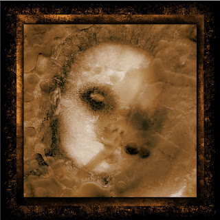
I started with a charcoal sketch and a candle. It was a regular seance. Be careful dripping the wax; if you drip from too high up, bubbles form that leave pits in the wax. Also, I discovered if you add a few drops of water to the melted wax before dripping, the water falls with the wax and will also leave bigger pits.
I scanned the image and worked on it in Photoshop. I added the two "gold leafed" backgrounds and drop shadow on the image. I call it "UNTITLED."

UNTITLED
Hello Nightmares...
I am using the original for another project now. I have burned my thumb 3 times, nearly set the house on fire and burned the bottom of my bathtub. You ought to see me with a glue gun... I really should have Googled all of this.


I had an illustration project to complete this week: create 3 female Tween characters in the style of MANGA. They were to be ethnically diverse. I was required to draw a Black girl, a Hispanic girl and an Asian girl. Now, this is more of my children's fare and not mine. But alas, I rose to the challenge. In the world of MANGA, I discovered, there seem to be only 2 races: Asian and American. And who has eyes that big? Except those big eyed children of the 60's, I mean.

My mom had those hideous children hanging on the wall of our hallway. No wonder I was afraid to get up and pee at night. We also had a velvet red-headed Jesus. One day I need to post how Jesus was an Irish Red Head... At least in my house he was.

This illustration (the one I did) is for a board game with the same demographic. I read in my research that next to Baby Boomers, Tweens have the largest expendable income. Which would be what? An allowance?

TWEENS
 I hate Manga.

BUNNY FLOP
Bunny behavior is an interesting thing. I observe it often to help with my sketches. I ventured to the pet store today. I use "research" as an excuse but I go there to hold the bunnies. No, I am not joking. There was an older youngster in the pen just binkying like crazy. I held him and he was quite personable. He was put back in the pen and did a Bunny Flop. I have yet to capture either Lance or Sammy doing a flop on video.Here's a flop for you via Youtube -- you have to wait for it for a few.


Anyway, I think I am inspired for the JOKER card. This is the last hold-out in my deck. Stay tuned. In the meantime, here are more bunnies.


The first is a pencil doodle from my sketchbook. The second is the ink version, 3rd is live trace, 4th is the illustrator "Dutch" bunny, 5th Photoshop and the 6th and last bun is simply the live trace with a color. What? I was trapped in the snow. What did you expect?

WHAT TYPE ARE YOU?
This therapist will tell you. I am DOT MATRIX.
CLICK ME


DEAR GOD I CANNOT TAKE THIS EXCITEMENT.


TWO FAVORITES
Don Hertzfeldt's "Rejected" was a life changing experience for me. I viewed it and actually believed that I was witnessing the process of ILLUSTRATOR BURNOUT. And it was funny. And now, here is Hertzfeldt's animated gifs and icons for your amusement.


http://www.hoyso.com/props/don/animations.htm

David Thorne's blog is most HEE-LAR-RIOUS.  The first thing I ever read of his was THE 7 LEGGED SPIDER. 

CLICK TO READ ABOUT ME!


 Enjoy the entire blog: DAVID THORNE


BUY THIS FOR ME
HAVEN'T YOU FIGURED OUT TO CLICK ME?


DO IT.